

10:43 home - созидаем предметы уюта и тепла для дома. Продукция бренда делается в ручную и не заточена на массовость. Больше - не значит лучше. Нечего взять, зато можно оставить, что-то важное здесь новым людям на память.
Философия заключается в использовании только лучшего сырья, что может предложить рынок, никакой экономии на качестве продукта. Основа продуктов-это натуральные природные компоненты.
Философия заключается в использовании только лучшего сырья, что может предложить рынок, никакой экономии на качестве продукта. Основа продуктов-это натуральные природные компоненты.
10:43 home - we create items of comfort and warmth for the home. The brand's products are made by hand and are not intended for mass production. More doesn't mean better. There is nothing to take, but you can leave something important here for new people as a keepsake.The philosophy is to use only the best raw materials that the market can offer, without skimping on the quality of the product. The basis of the products are natural ingredients.


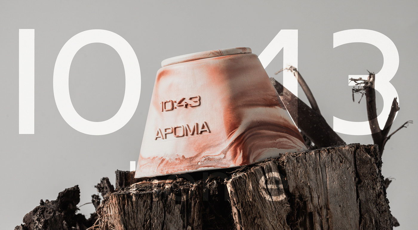
Цифры в логотипе написаны прямым шрифтом Montserrat Medium. Логотип без лишних засечек, что добавляет минимализм и эстетику, отражая харакетр бренда. 10:43 означает время зарождения вселенной. Молодой бренд, так же как и вселенная в начале своего пути, будет создавать и творить, чтобы прийти к гармонии и процветанию.
10:43 - время дарить любовь.
The numbers in the logo are written in Montserrat Medium font. The logo is without unnecessary serifs, which adds minimalism and aesthetics, reflecting the character of the brand. 10:43 means the time of the birth of the universe. A young brand, just like the universe at the beginning of its journey, will create and create in order to achieve harmony and prosperity.10:43 - time to give love.

Цвета для бренда подобраны спокойные в пастельных тонах и в телесно-бежевых оттенках.
Через фирменную палитру мы передаём ощущение уюта, качество и премиальности.
Через фирменную палитру мы передаём ощущение уюта, качество и премиальности.
The colors chosen for the brand are calm, pastel tones and flesh-beige shades.Through our signature palette we convey a feeling of comfort, quality and premiumness.


В основу разработки паттерна взяли цифры из логотипа, связанные со временем зарождения
вселенной. Цифры и слово «home» разбросаны в хаотичном порядке, как звезды на небе.
вселенной. Цифры и слово «home» разбросаны в хаотичном порядке, как звезды на небе.
The pattern development was based on the numbers from the logo associated with the time of originuniverse. The numbers and the word “home” are scattered in a chaotic manner, like stars in the sky.

Портрет целевой аудитории
Девушки. Эстеты&Независимые.
Portrait of the target audience Girls.
Aesthetes&Independents.

Дизайн открытки
Postcard design

Дизайн наклеек
Sticker design


